Instapro, a leading home services platform, is rapidly expanding its reach across multiple brands and countries. This growth, while exciting, presented a challenge: maintaining a consistent and high-quality user experience across diverse products. Recognizing the need for a unified approach, I spearheaded the development and implementation of a comprehensive design system to streamline design and development, improve user satisfaction, and position Instapro for continued success.
Jun 2022 — Jun 2024
Instapro, MyBuilder, MyHammer, Wekspot, Travaux
Product Designer, Design System Lead
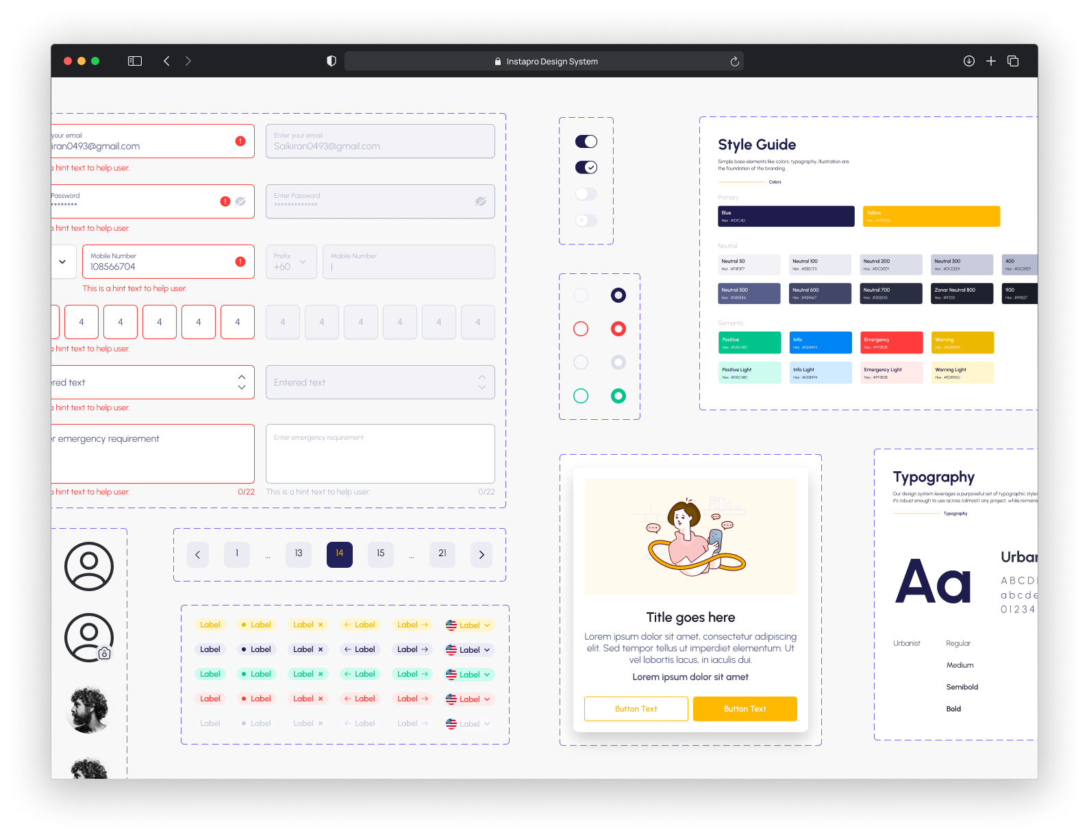
Figma
Upon joining the Instapro team, I quickly identified that the existing design system, while in place for two years, suffered from several issues that hindered its effectiveness.
These challenges were creating fragmented user experiences and slowing down the development process. This was especially problematic given Instapro's rapid expansion and the need for agility and scalability.
As the Lead Designer of the Design System, I worked closely with UX designers, developers, and product managers to revamp and implement a cohesive system. My contributions included:
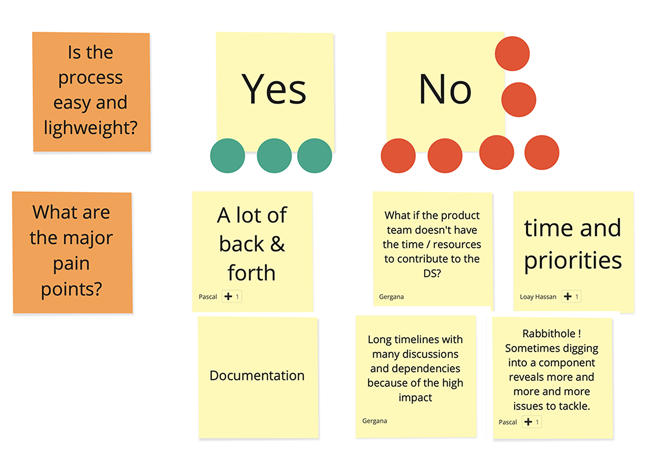
We conducted in-depth interviews with designers, developers, and product managers to identify pain points and prioritize improvements. This alignment ensured buy-in from key stakeholders, laying the foundation for successful implementation.
Our approach focused on addressing the core challenges through the following key initiatives:
One of the first things that I did after joining the team was stakeholder interviews. I started talking with most of the UX designers, UX researchers, content designers, UX managers, some of the product managers and developers. It helped me to have a better understanding about their knowledge and expectation from the design system.
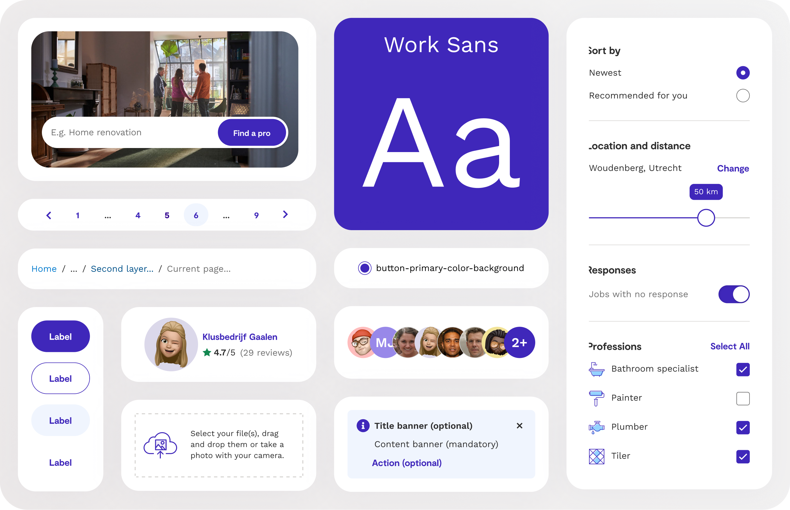
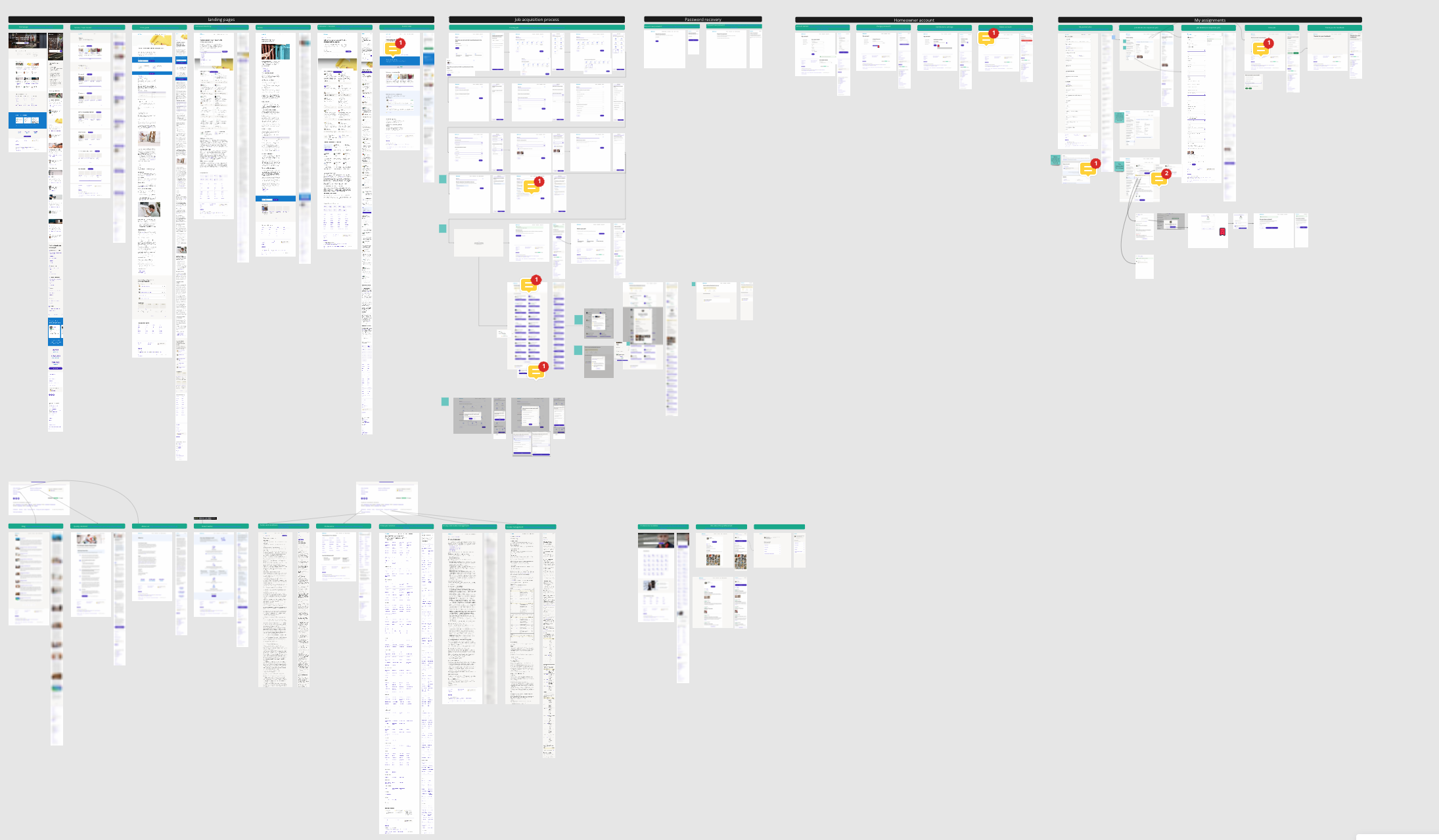
As a product designer working in the design system team, it is very important to have a holistic view of the product to understand the scope of the work, the common patterns, and the potential oppotinities to be addressed. With the collabration of the product manager of the team and the UX design guild, I could gather the screenshot of most of the pages and categorize them by the flow.
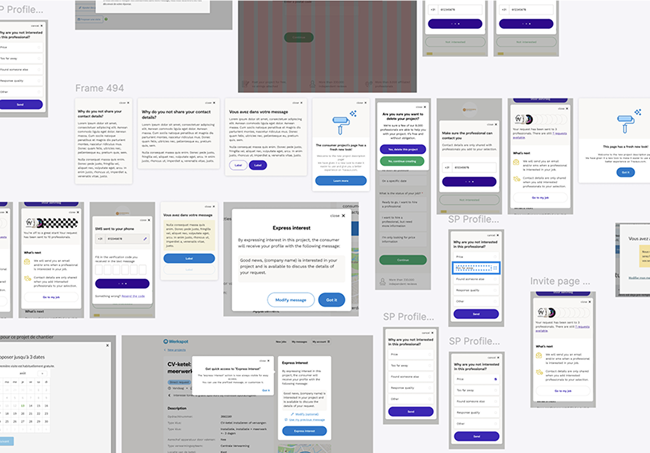
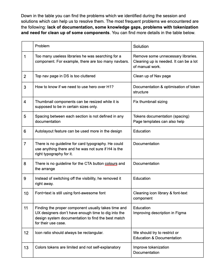
Usability testing is a common approach among the product designer to test the product. I brought this approach to the design system team to test the usability of our components and spot the hidden flaws in the library.
As I explained earlier, we had no way to measure the adoption of the design system in different teams. I led this topic and shared it with different stakeholder to set some adoption metrics such as Figma statistics (by upgrading the Figma subscription to the organization plan), number of feature request, number of contributions, NPS score from the users (product designers).
We had a regular UX design guild weekly meetings and I took some of this time every week to present the new enhancements that we made in the design system team and the ways to use them. In this way we ensured that the designers get the updates even they don't read the channels or the release notes. Also it increased their adoption, engagement, and contribution to the design system.
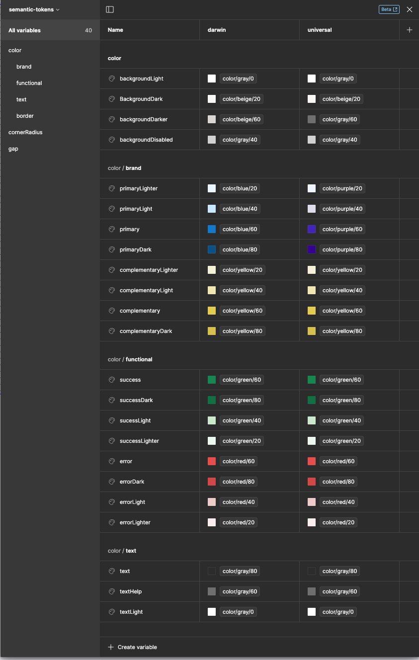
As we had an intention to rebrand in the future, we needed to make sure that the rebranding will happen smothly. I emphesized on the token structure topic as one of the most fondumental building block in the design system. I presented the benefits of having centerlized multi-layered token structure to different stakeholders and started to shift to token structure over the time.
One of the problems I saw among the product designers was using FontAwesome font instead of SVG icons. It was a frustrating job to find a font name every time and paste it to show the icon. Also it was hard to manually make more than 1500 components in for icons in Figma. As I was able to write Figma plugin, I took some days to write a plugin to autome the process. As a result, I managed to make components for all of the icons in FontAwesome and make the size and the style variant for each of them.
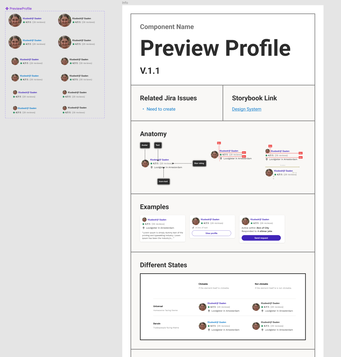
To bring the consistency into the design system documentation, I led the discussion to make a structured template in order to give this oppotunity to everyone to contribute to the design system documentation. We observed an increasing amount of contribution to the design system documentation after introducing this template.
There was a new innitiative the the company to release some podcasts. We found it a very good oppotunity to make more awareness across the organization. I attend to one of the episodes to explain the design system. You can find it in Instapro Show on spotify.