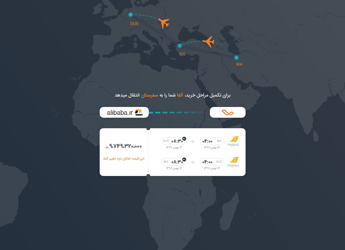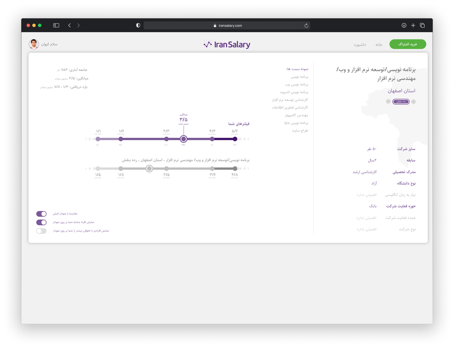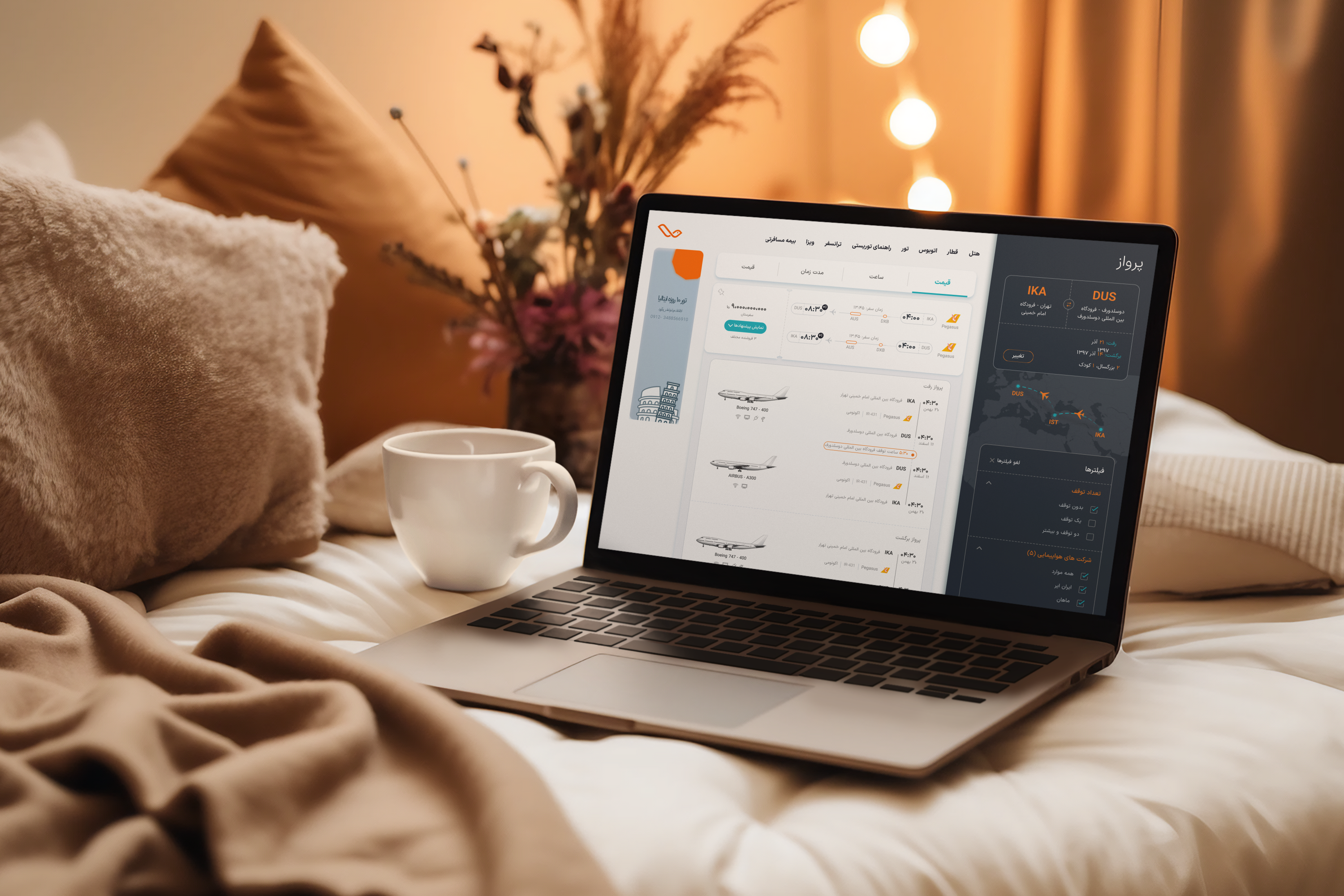
“Safar Market is one of the biggest Iran’s B2C tourism marketplace by IRSA, offering seamless access to flight tickets, hotel bookings, and tour reservations. As the Product Designer, I led the UX/UI design for the web and mobile platforms, creating a scalable design system that improved development efficiency and user experience.
October 2018 — September 2019
Safar Market | Tourism Marketplace
Product Designer
~320 Pages
Sketch App / Zeplin / Plant / Atomic Design / Market Research / Interview / Sketching / Wireframing
"Safar Market" is a product of IRSA Company which is a marketplace for travel agencies to provide flight ticket, hotel reservation, tour reservation, etc.
“IRSA” as sole partner of IATI in Iran is a B2B online travel solutions provider. It specializes in providing complete online services, enabling a seamless and fast communication between travel product suppliers and sellers such as travel agents and tour operators.
IRSA company has about 10-years of experience in B2B services in the tourism field. They had a vast range of connections with agencies and tourism companies. They decided to announce their first B2C product called “SafarMarket.com”. The main purpose of SafarMarket.com is to be a marketplace for agencies to provide their services. There were 9 types of products with different parameters, attributes, and functionality provided by agencies. We needed a robust marketplace with a uniform functionality to provide their services decently. The project should be designed for the website, responsive, android, and ios.
We worked as a 2-designers team. About 5 developers were ready to kick-off the project. So we had about 1 month to do research and design screenshots to deliver. We had to deliver some screenshots to developers as soon as possible in order to start the development step. Also, some parts of our product have the same elements. Therefore, the need for a design system was strongly felt in the project.
Conducting interviews is essential in gathering information, throughout the years I’ve learned that the better you get at this the more useful the information will be. Knowing how to structure your questions, how to listen and how to be grateful is the key.
I conducted about 8 interviews by stakeholders, agencies, and users to understand their pain points and their needs.
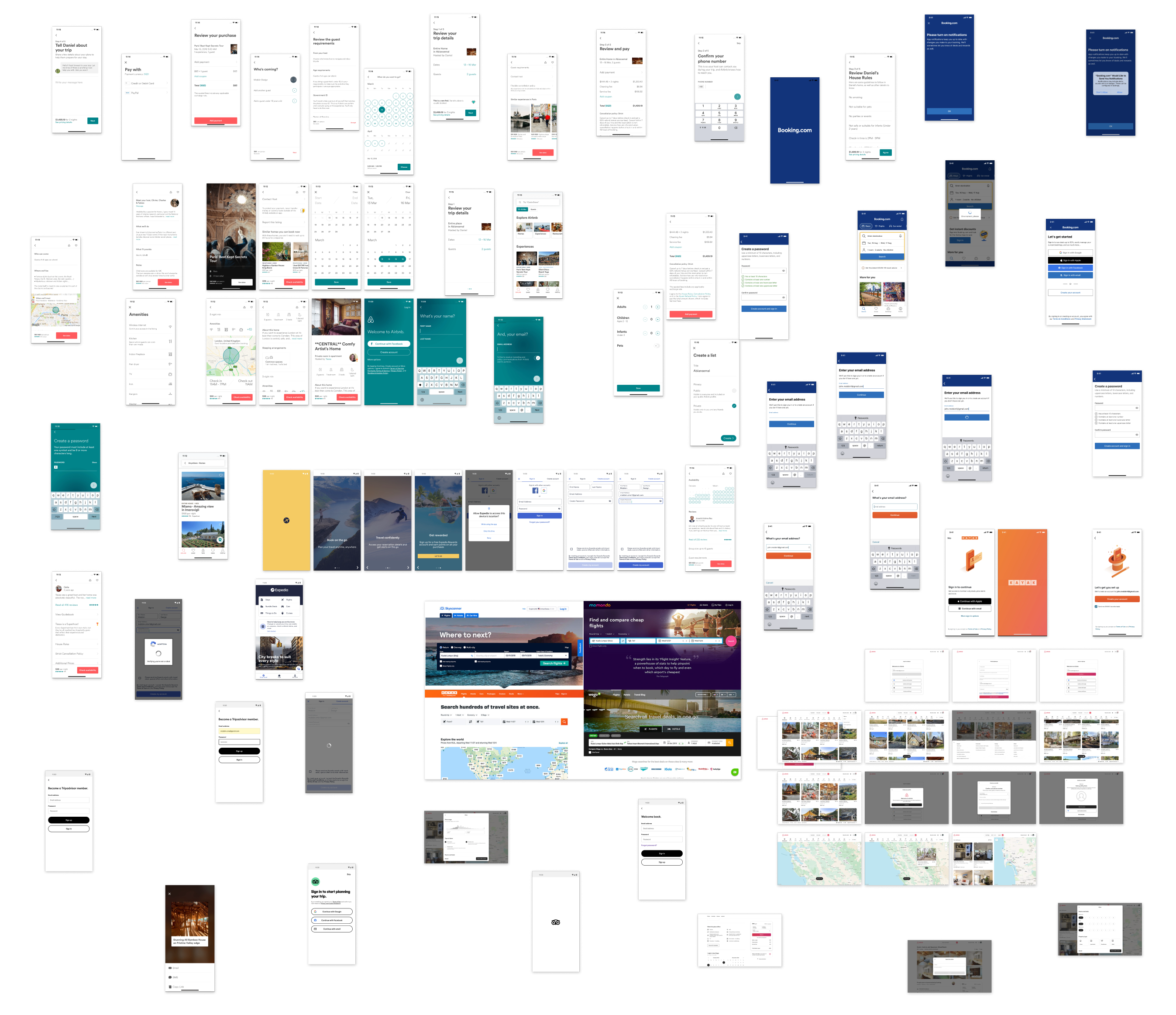
Competitive analysis is used to evaluate how a given product’s competition stacks up against usability standards and overall user experience, it also helps understand how the major competition in your space is handling usability.
I did some research about the websites which are similar to our functionality. I observed and listed all of their features for future decisions. Here are some websites from which I extracted features:
We conducted some kick-off meetings to discuss the features and the future of the product. We cleared the business journeys and set the priority of every feature and sub product. We considered our resource limitations including time and human resources.
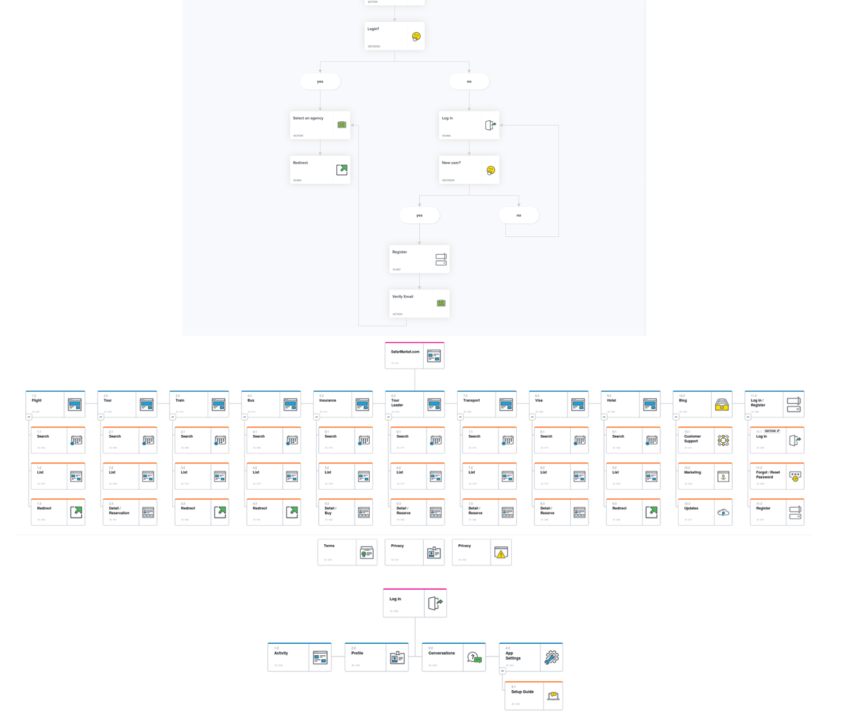
A site map describes the different content pieces on the site and the relationship between them. It is an important step of the user-centered process as it ensures content is in places users would expect to find it.
It’s vital in project’s development to have a well-defined audience, that will ensure that all of the design, functionality and content decisions are targeting the right people, there are many business examples that have failed because of not understanding their audience.
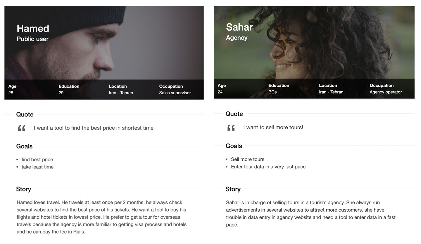
After figuring out who the audience of the project is, I normally build the personas. This is similar to shaping a piece of clay. By doing this I’m creating a clear image of who the user in our audience is.
I have created various personas but there are two important personas who make up the majority of our audiences. I address them as two examples of my personas.
A person’s experience during one session of using a website or application, consisting of the series of actions performed to achieve a particular goal is called a user journey. We use this technique to identify and catalog all interactions that the user might have with the platform.
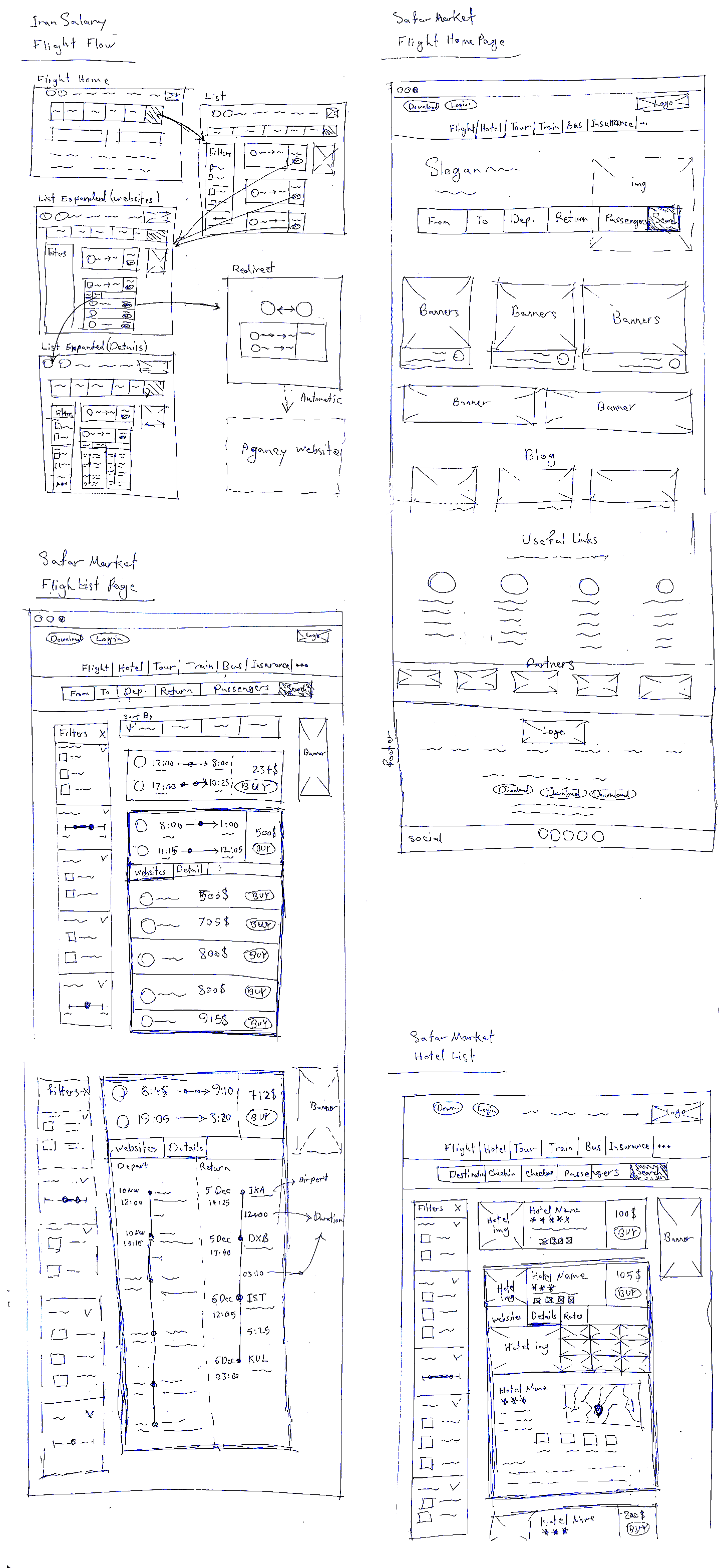
A prototype that is sketchy and incomplete, that has some characteristics of the target product but is otherwise simple, usually in order to quickly produce the prototype and test broad concepts.
I drew some sketches for pages and journeys which needed to be clear at first.
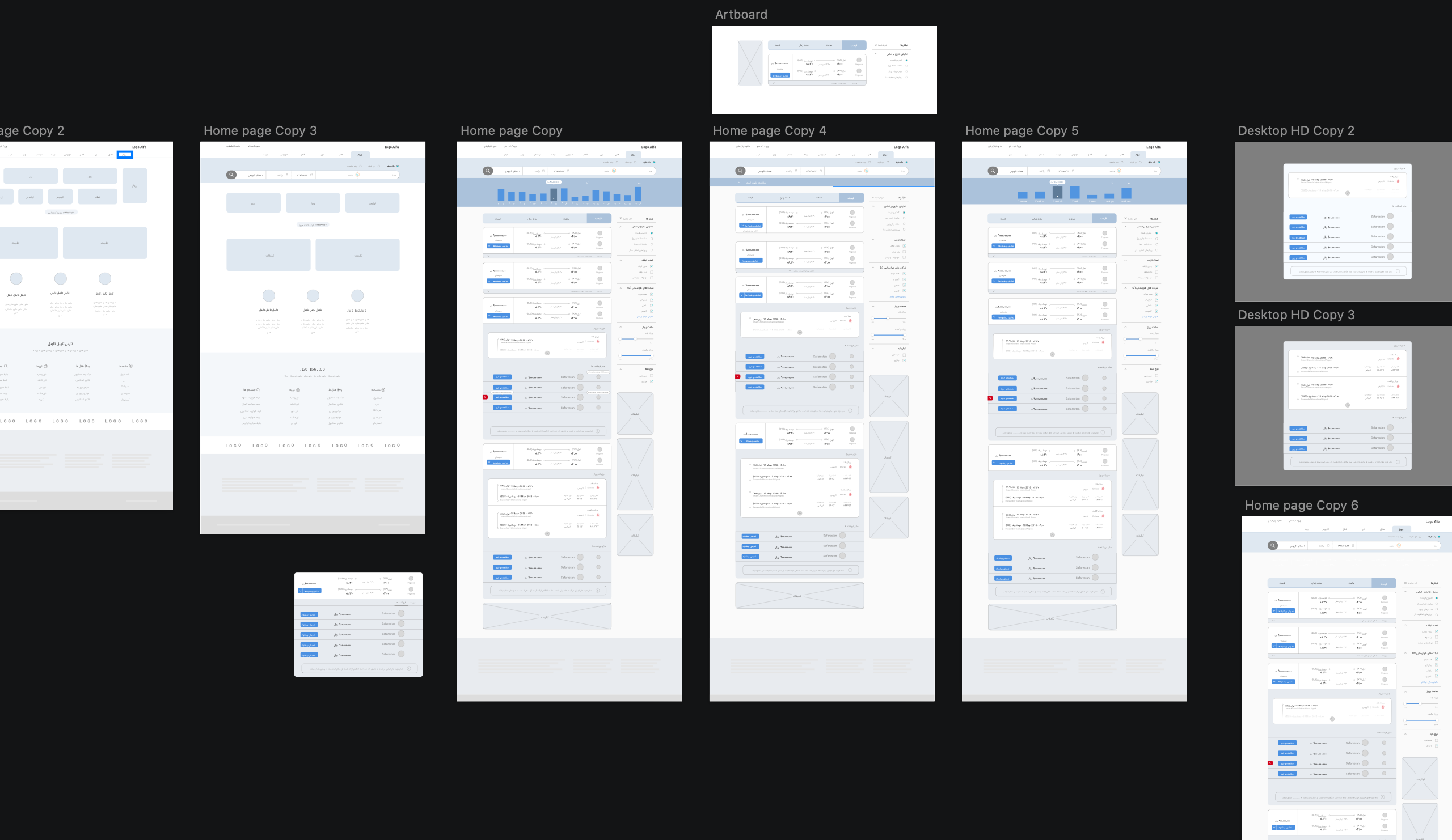
A wireframe specifically focuses on space allocation and prioritization of content, functionalities available, and intended behaviors, it allows you to determine the information hierarchy of the design while making it easier to plan out the content and user experience
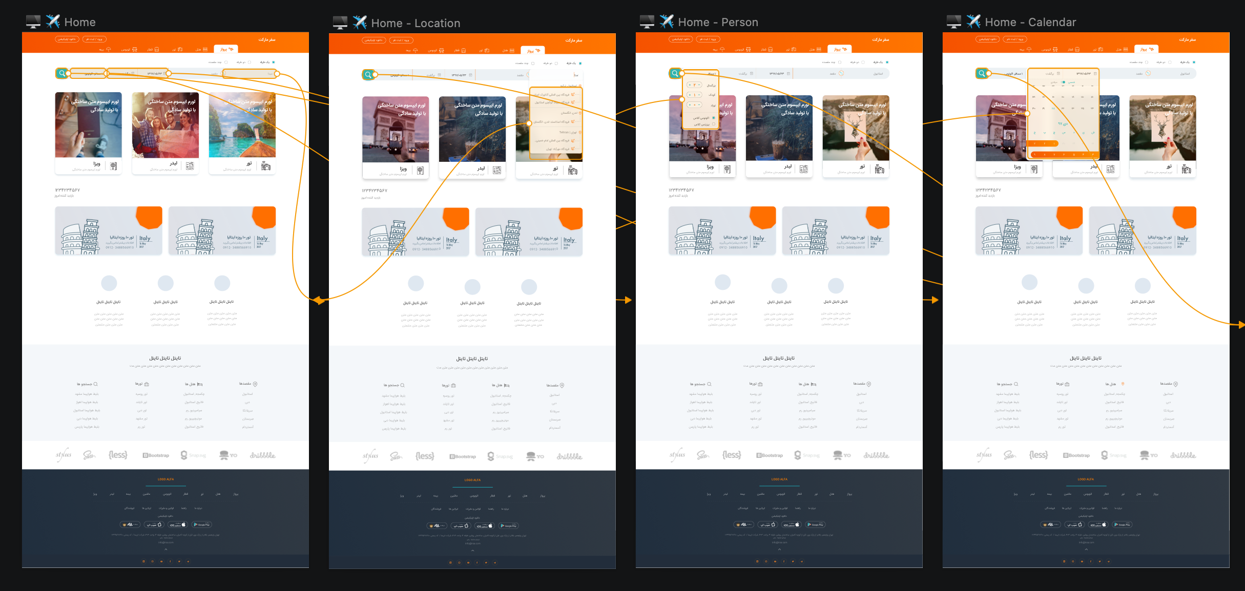
The visual design maximizes the aesthetic, information-conveying capabilities of graphics and text. It’s actually a subdiscipline within the UX process, contributing to UI Design, information design, and graphic design.
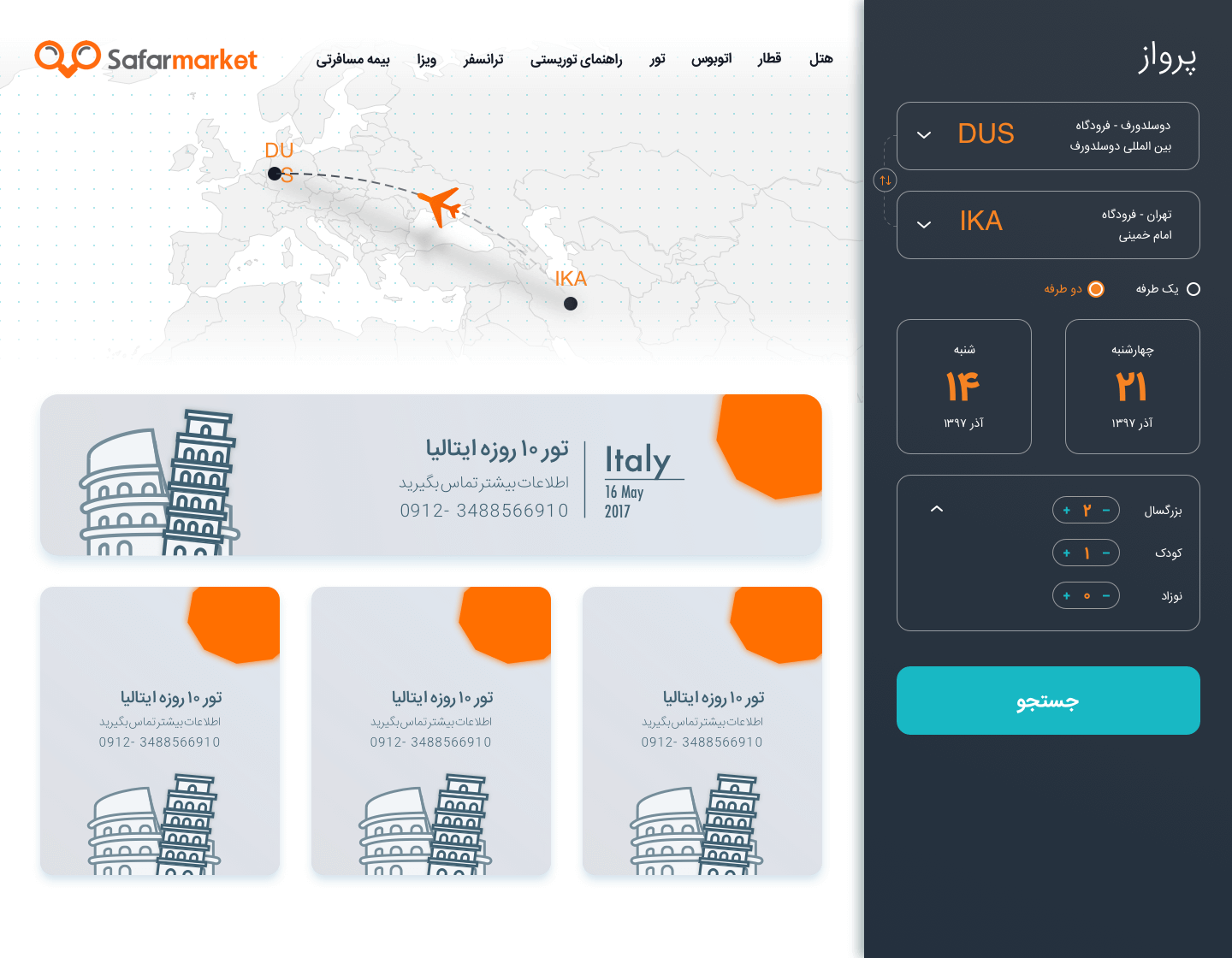
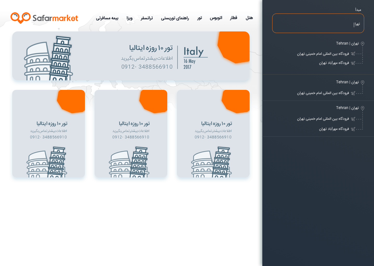
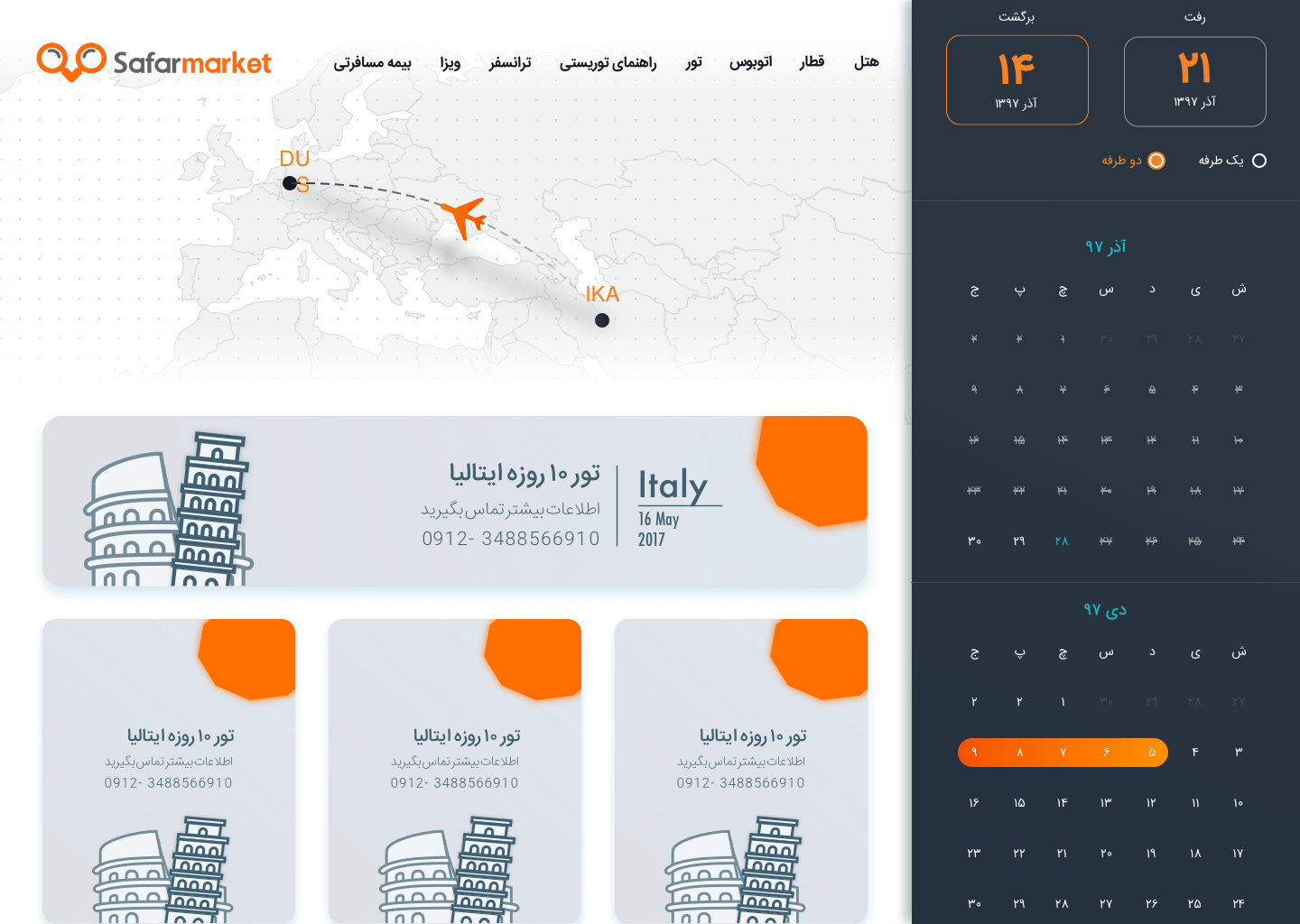
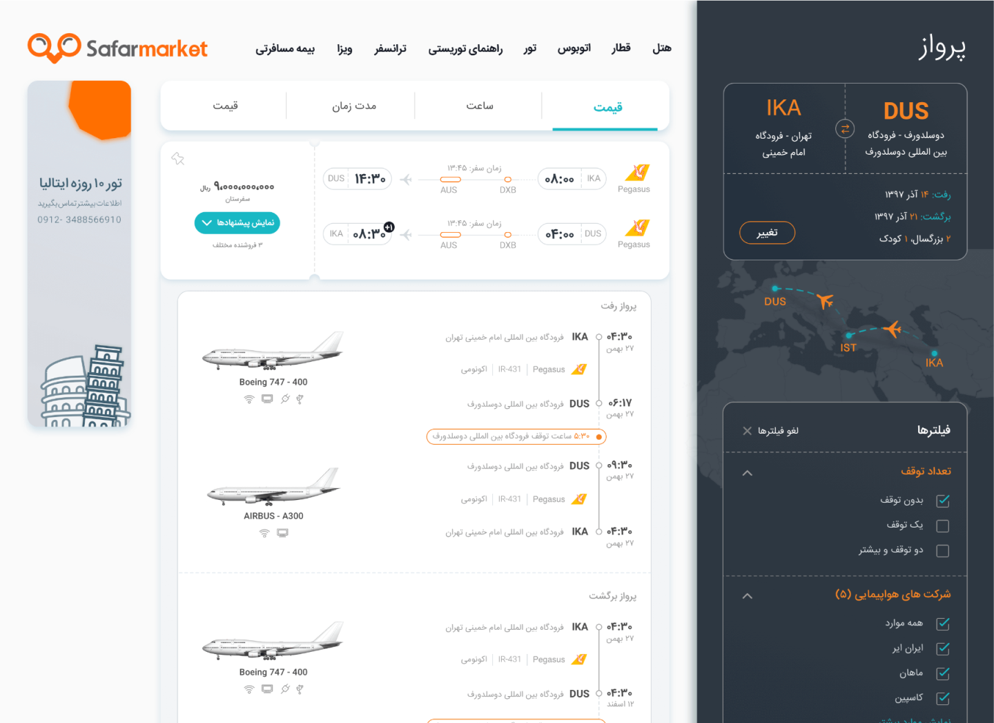
We designed about 320 pages for desktop version website, responsive website, android version, and iOS version. The design team collaborates by means of a sketch version control tool called “Plant”. After approving each page, we uploaded the page on “Zeplin” to facilitate developers’ workflow.
In order to make good decisions about both design and implementation you need data about how people use designs, and the only way of gathering this data is through usability testing.
I made the product prototype using “Sketch Prototype Tool” and conduct about 15 usability testing sessions to make sure that every section is understandable and easy-access for the audiences. I refined some features and navigations after the usability test.
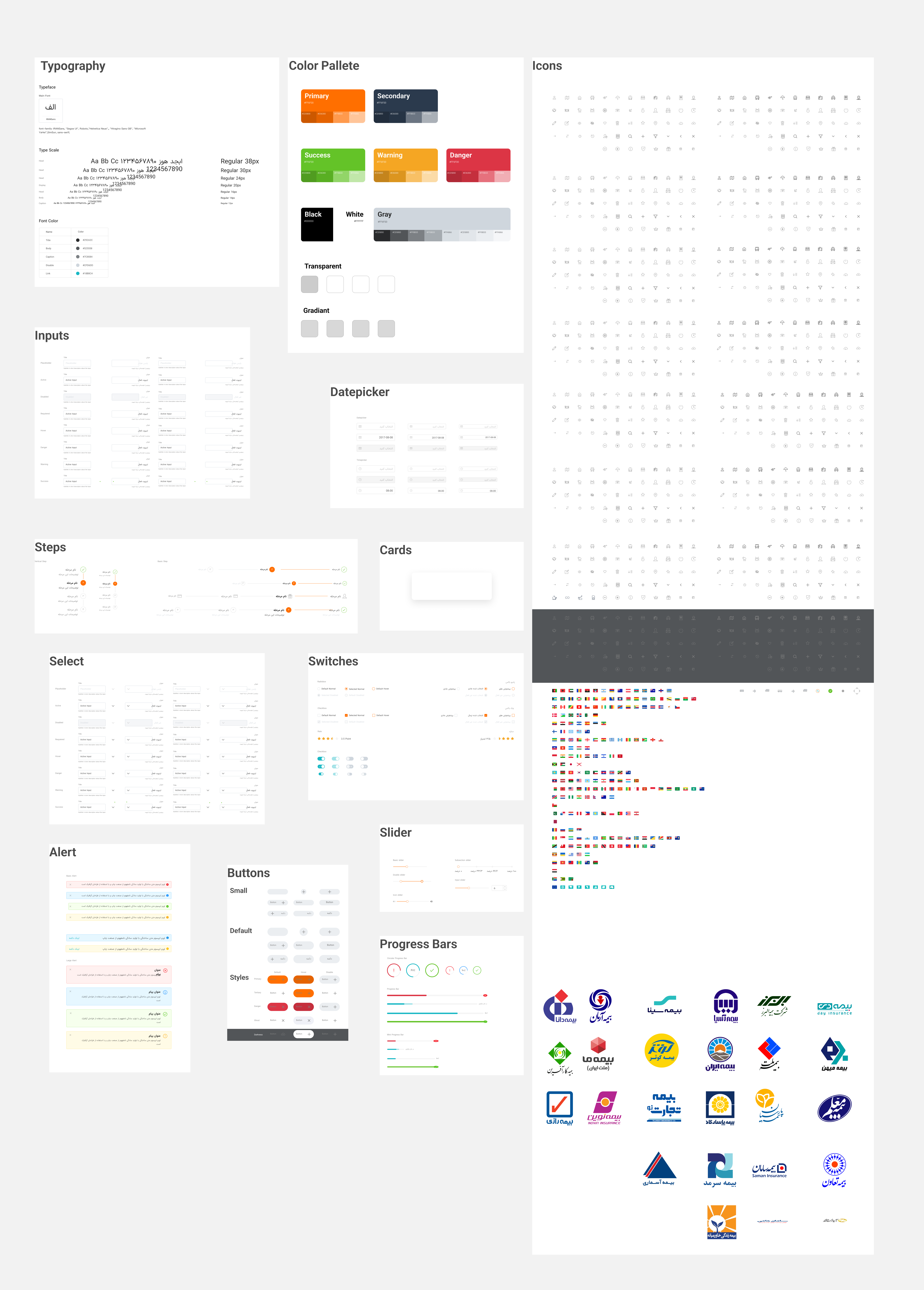
After delivering the firs phase of project, I had enough time to make a design system for this project. I followed atomic design principles and made all parts of project to multi-layer components. I reduced the sketch file size by 80% (before: ~350Mb, after: ~70Mb)