Design Engineer at the intersection of UX and AI. MS in Artificial Intelligence; I design and ship products end-to-end — from research to production React — and lean heavily on AI to compress every step in between.
Turkmenistan Operations Advance Reconnaissance Centre
CASE REVIEW
PETRONAS' Turkmenistan operations involved 500+ employees across 21+ distinct areas managing critical tasks through disparate emails, spreadsheets, and manual processes. This siloed approach caused significant inefficiencies, data entry errors, and lack of operational visibility. The Turkmenistan Operations & Activity Reporting Centre (TOARC) was developed as a unified web dashboard aimed at digitizing workflows, centralizing data, and improving collaboration across the organization.
21 operational areas · 50+ personas · 100+ pages · 11 phases shipped · 500+ daily users
MY ROLE
As the Lead UX Designer joining at project inception, I spearheaded the design of TOARC while leading a small design team within a large project (50-100 people). I established the UX process, mentored designers, collaborated intensely with PMs, BAs, and engineers, and designed a scalable, multi-phase dashboard framework.
My key contributions included designing reusable templates/components for 100+ pages across 11 delivered phases, integrating dark mode into the PETRONAS design system, and optimizing critical workflows. I was responsible for user research, creating user flows, wireframes, high-fidelity prototypes, and conducting usability testing for core features across all phases.
PROBLEM STATEMENT
The core challenges were multifaceted and complex:
Extreme Scale & Diversity: Designing a single system to serve over 50 distinct personas across more than 21 unique operational workflows.
Deeply Entrenched Manual Processes: Replacing reliance on emails, phone calls, and complex spreadsheets prone to errors and delays.
Lack of Centralized Data: No single source of truth, hindering reporting, decision-making, and cross-departmental visibility.
No Existing Digital Foundation: Building the entire experience essentially from the ground up.
Future Uncertainty: Needing to design a scalable framework without having detailed requirements for all 21 phases defined upfront.
KEY USERS
The platform needed to serve a diverse range of users:
Engineers: Required technical data visualization and reporting tools.
Technicians: Needed efficient data entry and daily reporting capabilities.
Managers: Required high-level dashboards and approval workflows.
QA Specialists: Needed detailed inspection and compliance tools.
Administrative Staff: Required document management and basic reporting functions.
With over 50 distinct personas across 21 operational areas, the challenge was creating a unified system that could meet such diverse needs while maintaining consistency and usability.
RESEARCH & INSIGHTS
My discovery and research approach was comprehensive:
1. User Research Methodology
Conducted extensive user interviews and stakeholder workshops for each phase.
Used the Jobs To Be Done (JTBD) framework to understand specific user needs and pain points.
Collaborated closely with Business Analysts to synthesize research and validate requirements.
2. Key Insights
Users were spending 30-40% of their time on manual data entry and report generation.
Data inconsistency was causing significant rework and decision-making delays.
The complexity of operations required a flexible but structured navigation system.
Many users worked in darker environments or night shifts, indicating a need for dark mode.
3. Navigation Framework Challenges
Initial design favored a simpler 2-level navigation structure.
User journey mapping and testing revealed potential usability issues for deeper, complex tasks.
Research validated the need for a more robust 3-level navigation to accommodate the complexity.
SOLUTION & APPROACH
Given the project's scale, we adopted a phased approach, tackling 1-2 operational workflows at a time:
1. Building a Scalable Foundation
Facilitated early collaborative sessions with PMs, BAs, and Engineering Leads.
Defined standardized page templates (sidebar, header, content area layouts).
Created a core set of reusable components identified through analysis of initial phase requirements.
Established a robust 3-level navigation structure based on user testing.
2. Component-Driven Design
Designed and documented reusable components within Figma, leveraging Atomic Design principles.
Contributed key patterns (including Dark Mode) to the central PETRONAS Emerald HUE design system.
Created high-fidelity prototypes in Figma for usability testing and developer handoff.
3. Workflow Optimization
Analyzed key workflows like Daily Lab Reports to identify inefficiencies.
Through user observation and co-design, introduced smart defaults, conditional fields, data grouping, and automated calculations.
Implemented batch processing and template-based approaches for repetitive tasks.
4. Continuous Iteration & Testing
Maintained daily check-ins with PM/BAs and regular feasibility checks with engineering.
Conducted usability testing with real users after each major design iteration.
Continuously refined the design system based on feedback and emerging patterns.
Personalized Dashboards: Role-based dashboards showing relevant KPIs, tasks, and alerts.
Streamlined Data Entry: Optimized forms with smart defaults, validation, and automated calculations.
Integrated Reporting: Centralized reporting with customizable views and export options.
Dark & Light Themes: Full support for both modes to accommodate different working environments.
Workflow Automation: Approval workflows, notifications, and task tracking to replace email-based processes.
IMPACT & RESULTS
During my time leading the UX effort, the project achieved significant milestones:
Successful Delivery: Designed and supported the rollout of the first 11 phases (out of 21) of TOARC.
Widespread Adoption: The platform became the central tool for 500+ employees daily.
40-50% Efficiency Gain: Achieved a substantial reduction in task time for critical workflows like Daily Lab Reports.
Design System Value: Reusable templates and component system saved significant design and development time across phases.
Improved UX Maturity: Established a structured, user-centered design process within the organization.
CONCLUSION
The TOARC project was a profound experience in tackling large-scale enterprise complexity and driving digital transformation. The project demonstrated how thoughtful UX design could unify disparate workflows, improve efficiency, and create a centralized operational hub.
Key learnings included the importance of early framework definition, embracing evidence-based pivots, and maintaining close collaboration across disciplines. The project solidified my ability to lead UX in complex environments, champion user needs, build scalable design solutions, and deliver impactful enterprise products.
SCREENSHOTS
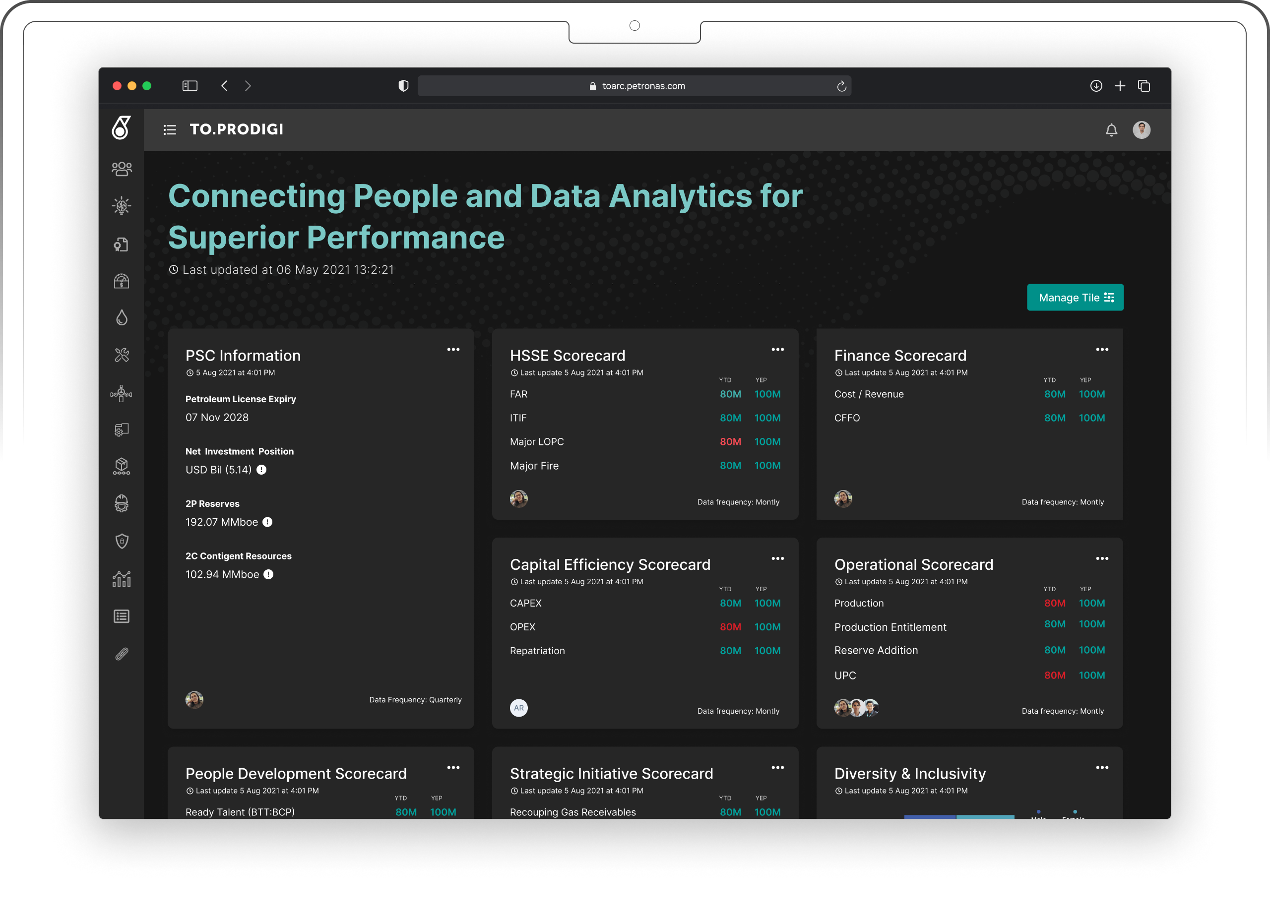
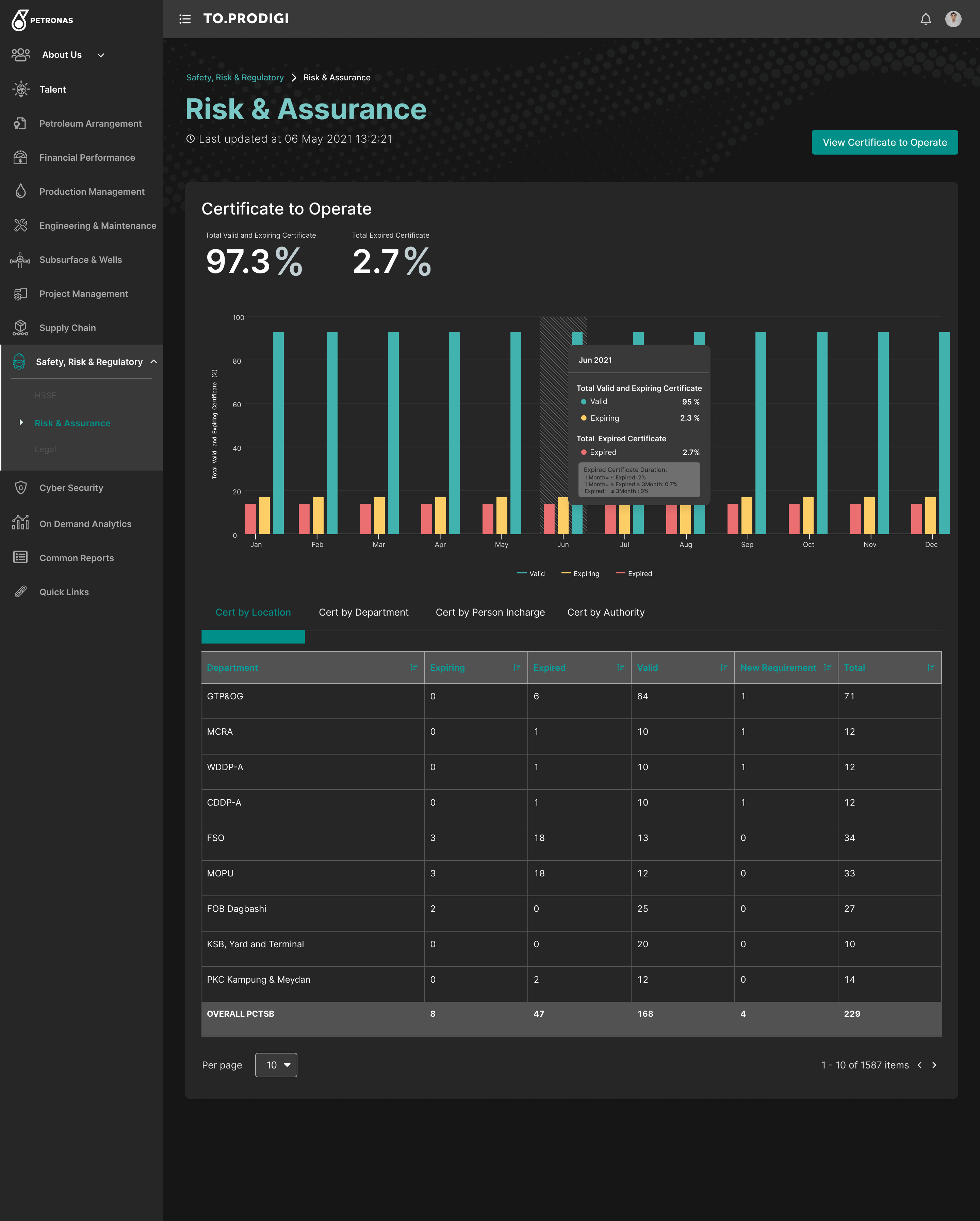
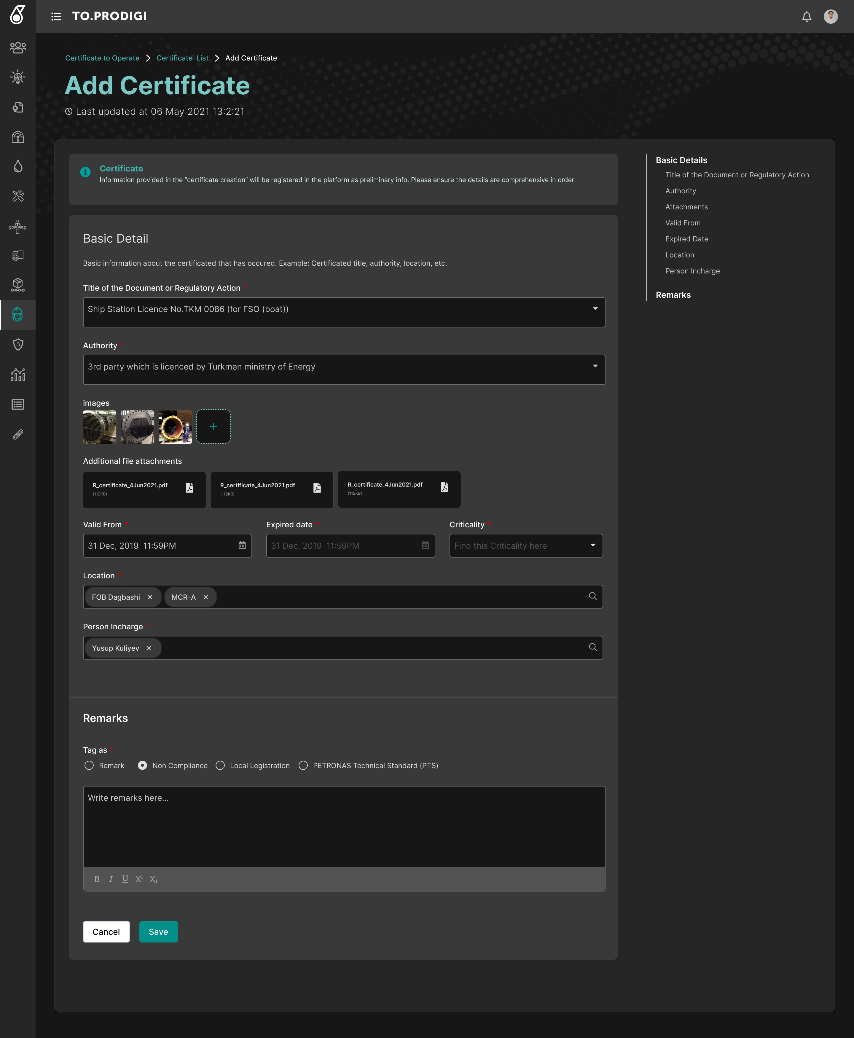
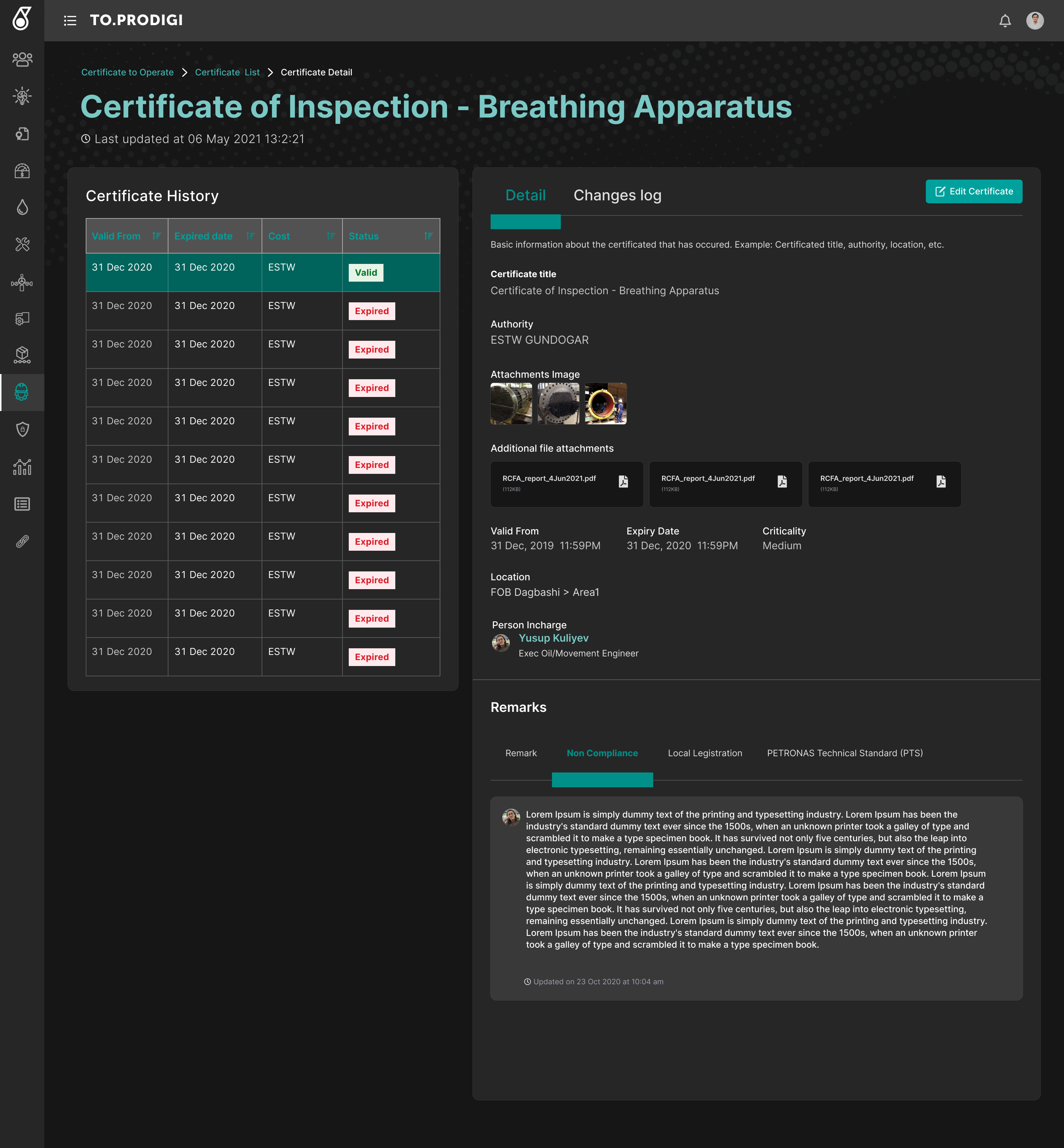
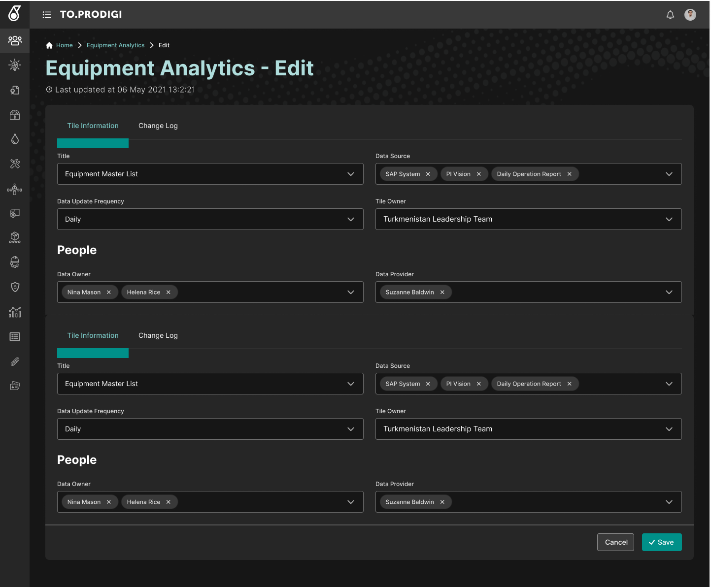
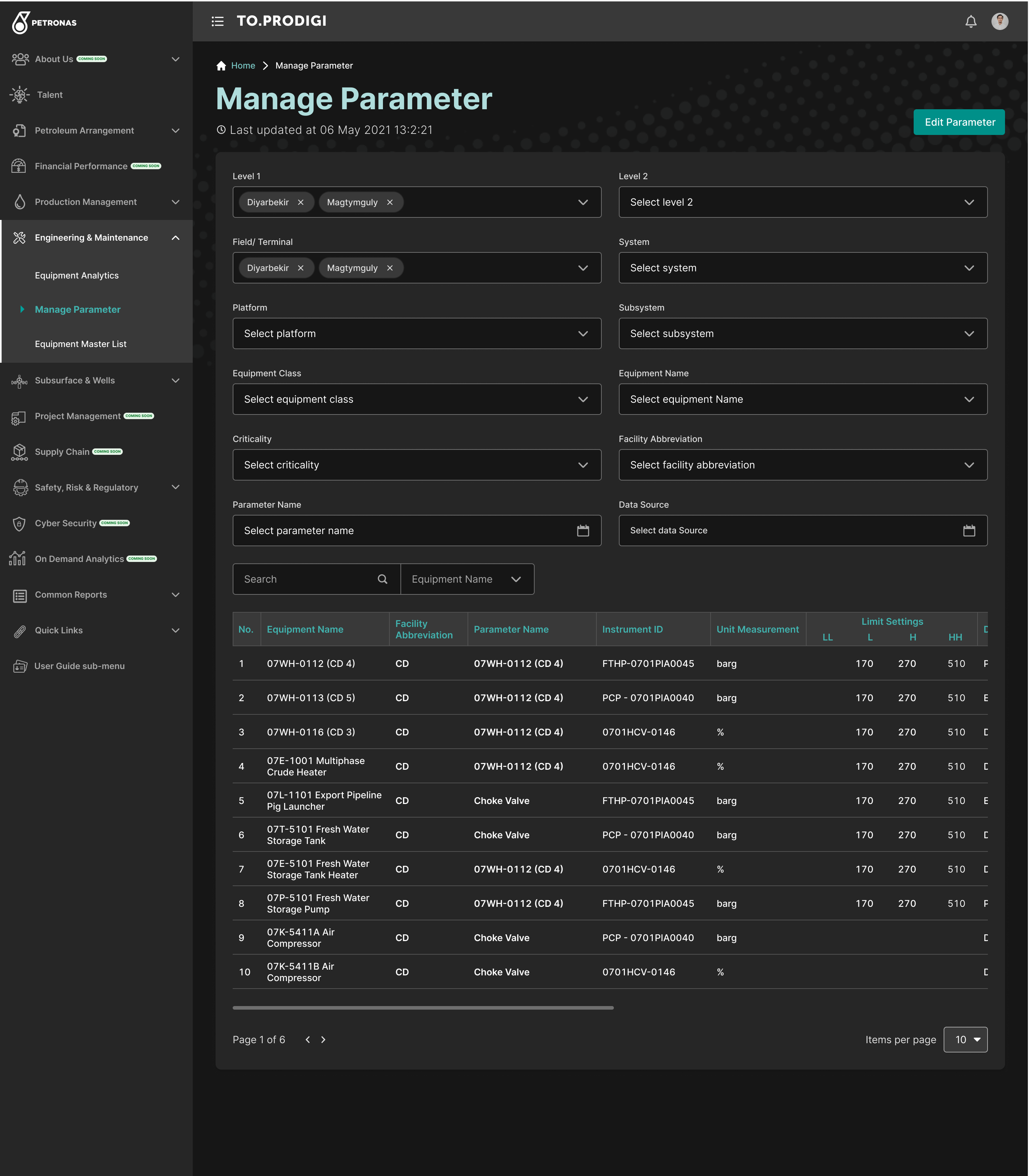
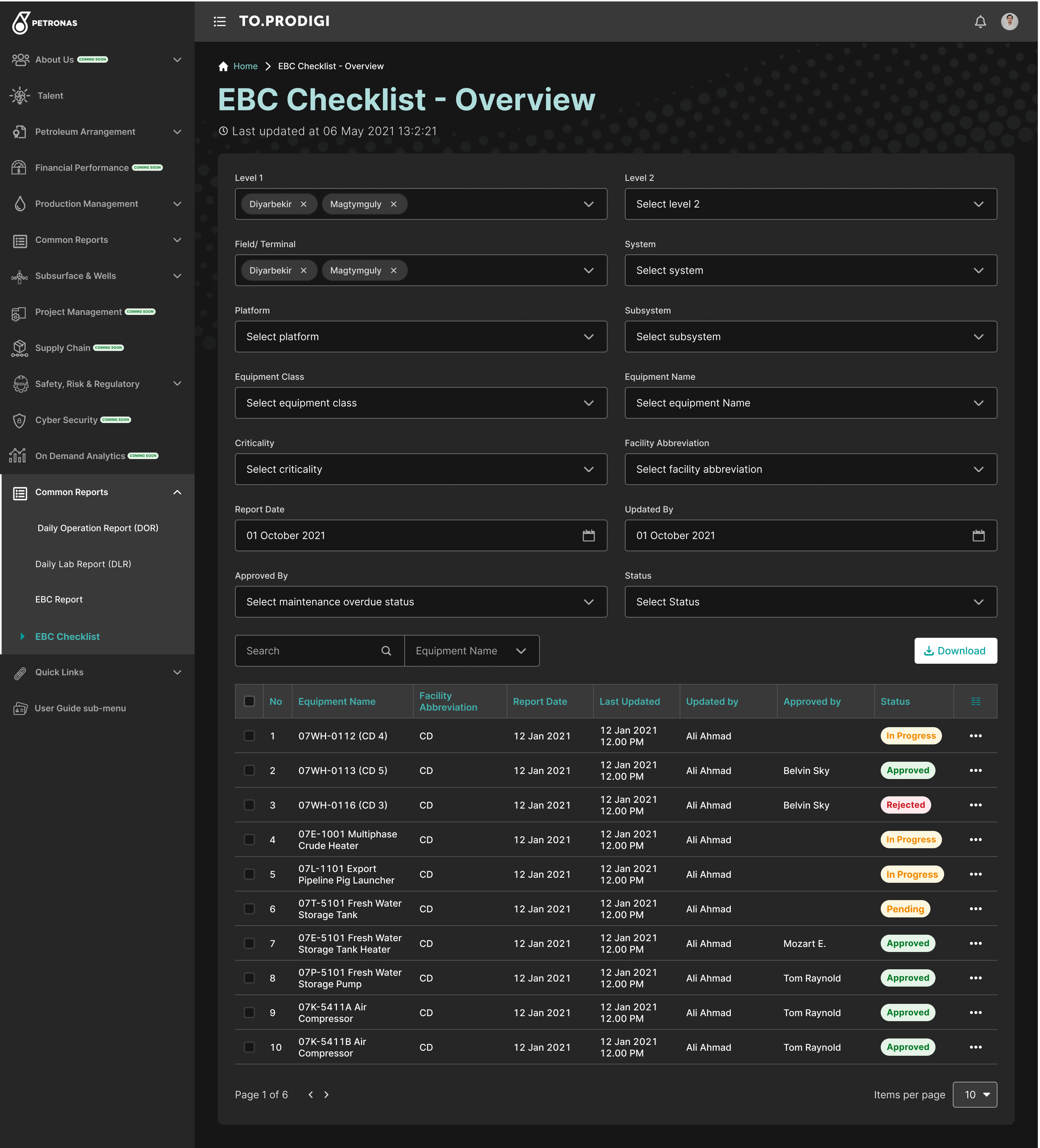
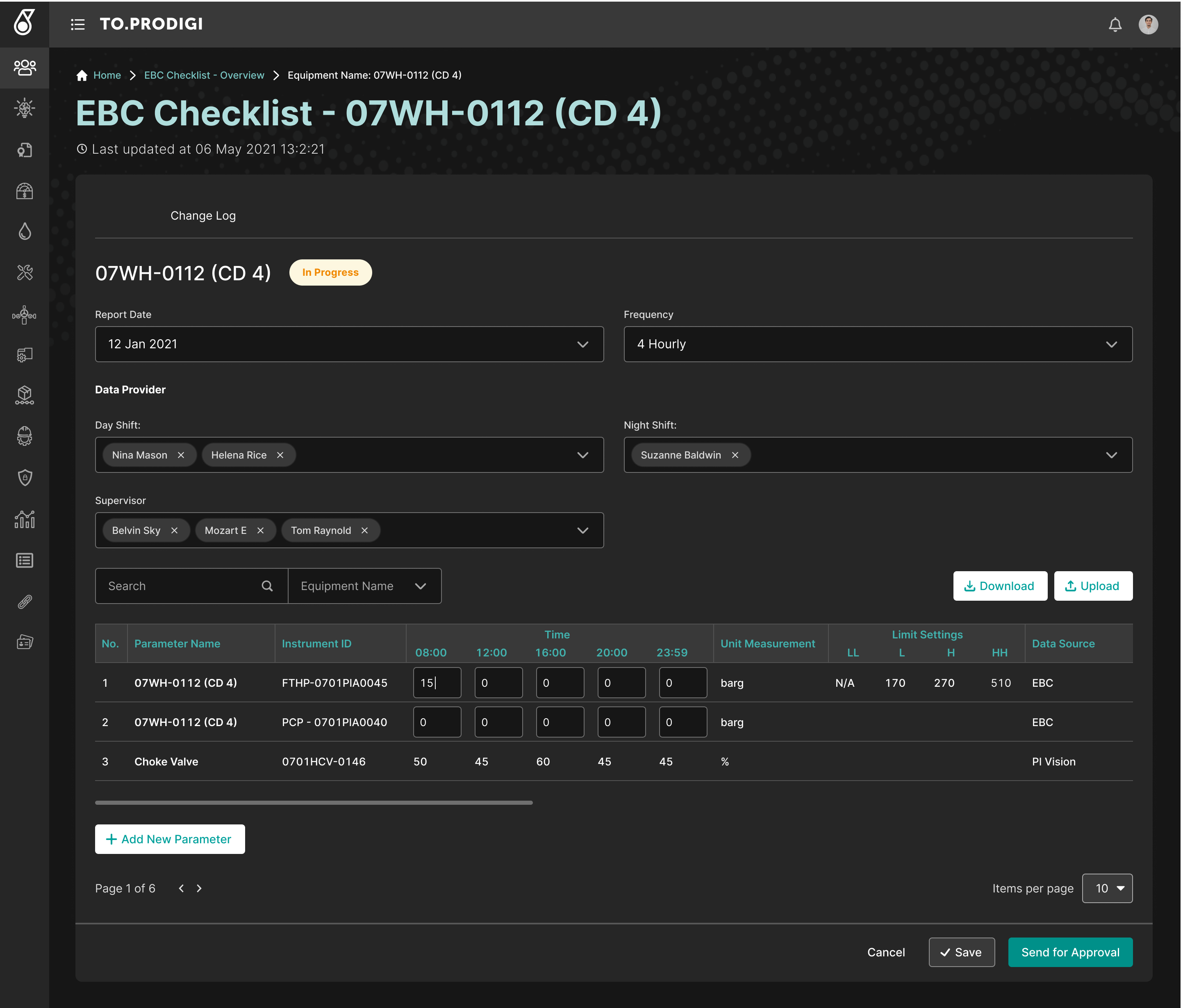
Risk & Assurance dashboard. KPIs at the top, distribution chart in the middle, sortable per-department breakdown below — one screen for "where am I?", "what's the trend?", and "where do I act?".Long-form certificate entry. Right-side anchor TOC keeps users oriented in a 7-section form; document attachments are first-class objects, not metadata; remarks are tagged for downstream filtering.Certificate detail. List–detail two-pane layout with a parallel Changes log tab. Status pills (Valid / Expired) make compliance state scannable at a glance.Equipment Analytics editor. Composite-form pattern for editing multiple data tiles in one screen, with multi-select tags for data sources (SAP, PI Vision, Daily Operation Report) so analytics are traceable to source.Manage Parameter. The 3-level cascading filter (Level 1 → Level 2 → Field Terminal → System → Subsystem) the case study describes, in working form. Filter state is visible, removable, and shareable.EBC Checklist overview. Same filter pattern as Manage Parameter — repetition across screens is the design system doing its job. Status pills (In Progress, Approved, Rejected, Pending) replace the email-chain approval flow.EBC Checklist detail. Day/night shift split, supervisor assignment, and time-bucketed parameter readings — the daily-lab-report pattern the case study identifies as the high-frequency workflow that earned the most optimization (smart defaults, conditional fields, automated calcs).
How I'd ship TOARC in 2026
If I were rebuilding TOARC today, here's where I'd lean on AI:
LLM-summarized daily lab reports: technicians dictate observations; an agent structures them into the existing form fields, flags anomalies against historical data, and routes approvals automatically.
Voice-to-form for technicians in the field, where typing on a phone in industrial gloves is the actual bottleneck.
Agentic workflow approvals — proposing routings, drafting responses, only escalating genuine ambiguity — replacing the 21 different email-chain approval patterns each operational area maintains today.
Natural-language search across phases: "show me the Daily Lab Reports flagged in Phase 7 last quarter."