
I designed Zonar's design system in 2020–2021 as a UX consultant. Five years later, the same design-system primitives — typography hierarchy, color palette, button and form treatments, navigation patterns — are still in production at zonar.my on the web and on iOS / Android.
I don't have hard usage metrics to share. What I have is durability: a system that survived from a small early-stage project to a live product with apps in both stores and third-party validation (MDEC certification, Business Today and Disruptr press features). When you can't quote DAUs, the next-best impact statement is: *the work was good enough that nobody had to redo it.*
Apr 2020 — Mar 2021
Zonar (zonar.my)
UX Consultant — Design System
Figma · Confluence (later folded into Figma)
Component audit · Token foundations · Cross-functional alignment · Accessibility · Documentation
5+ years in production · iOS + Android apps · MDEC certification
Zonar was an early-stage product when I joined. The team needed structure to design, iterate, and test efficiently — but also wanted to avoid the trap of locking in too much too early. The brief was a design system that would survive the product's growth: scalable, accessible, and consistent enough that any future contributor could pick up a component without re-deriving its rules.
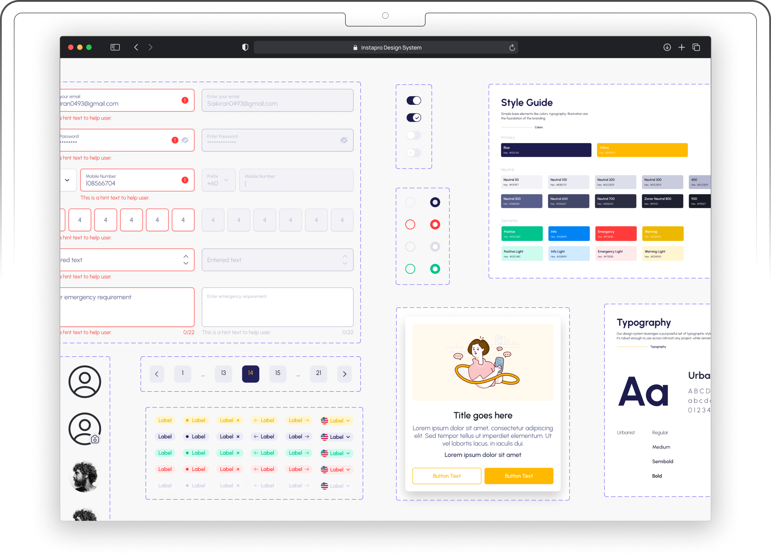
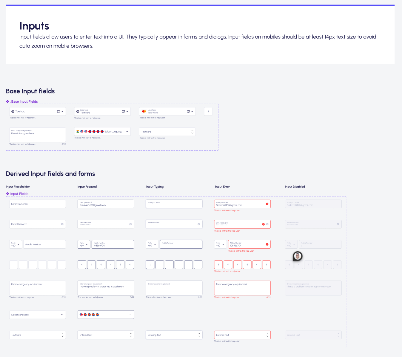
A design-system foundation, not a finished UI library. The deliverables were the primitives that anything else would be built on top of:
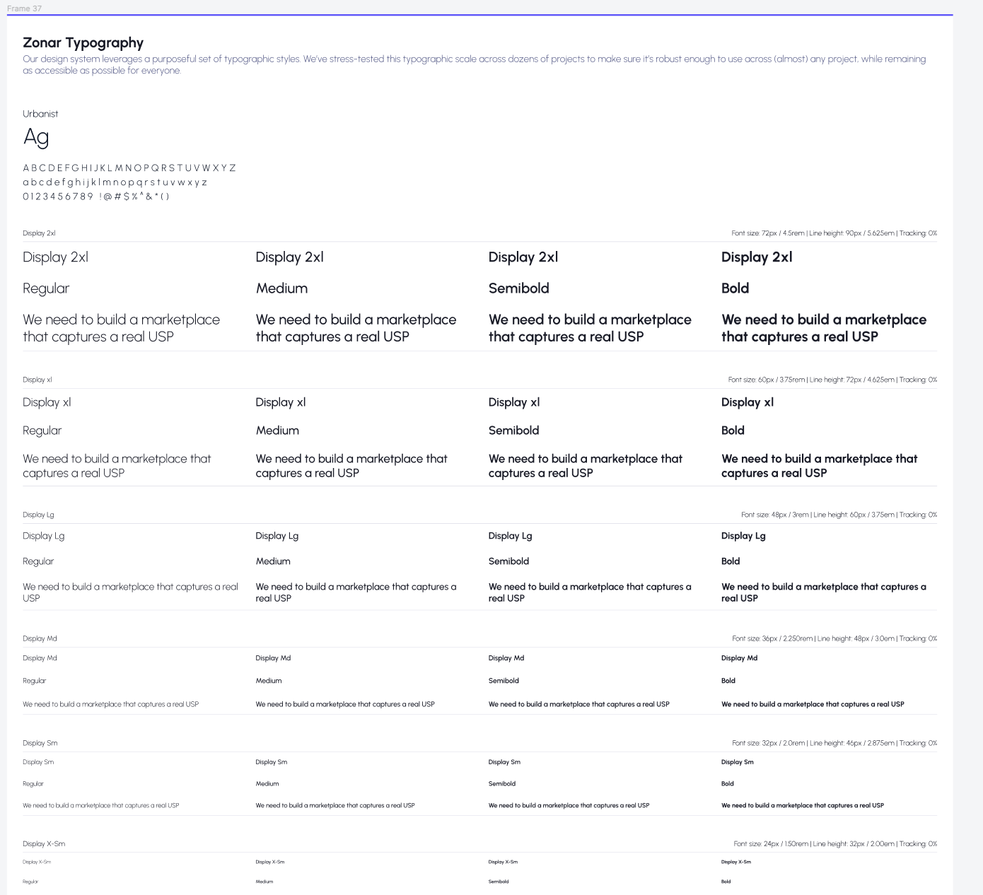
Urbanist as the primary face — open letterforms, wide weight range, broad language coverage for future expansion.
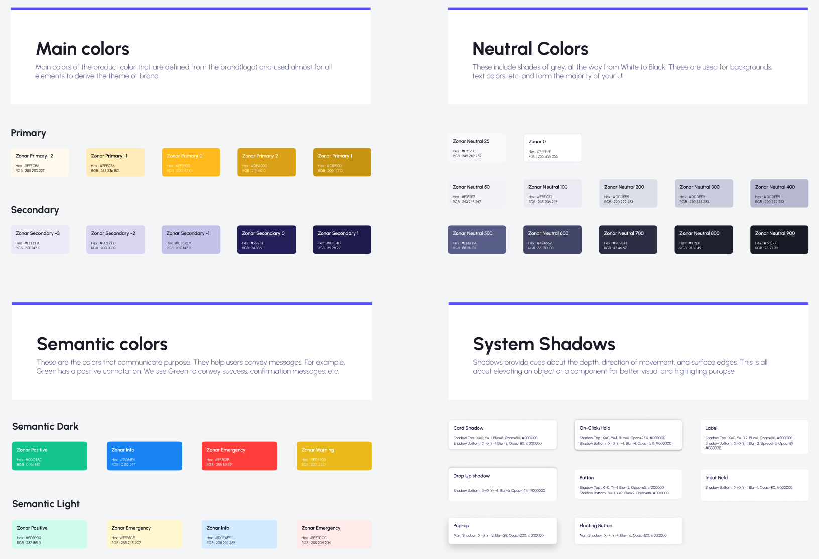
A blue / grey / yellow / white foundation with brand blue reserved for primary actions; reds for errors, yellows for warnings, greens for success, lighter blues for informational. Contrast ratios checked against WCAG so the same tokens worked for users with reduced visual acuity.
Primary, Secondary, Ghost, Link — each with default, hover, focus, and disabled states, in regular and large sizes. The smallest set that covered every interaction surface.
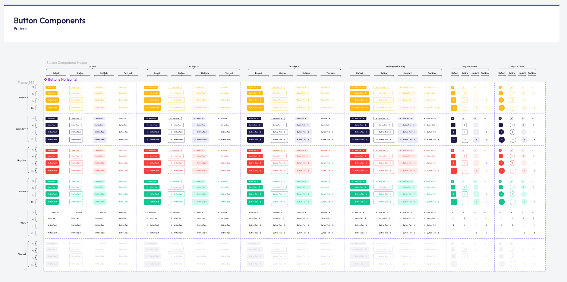
Field titles stay visible after selection; errors aren't conveyed by color alone. Dropdowns, checkboxes, radios, and the rest follow the same rules. Accessibility was the constraint, not an afterthought.
Started in Confluence per company tradition, then centralised in Figma after a review — Confluence pages kept as redirects to the canonical Figma files. The shorter handoff path mattered more than the policy compliance.
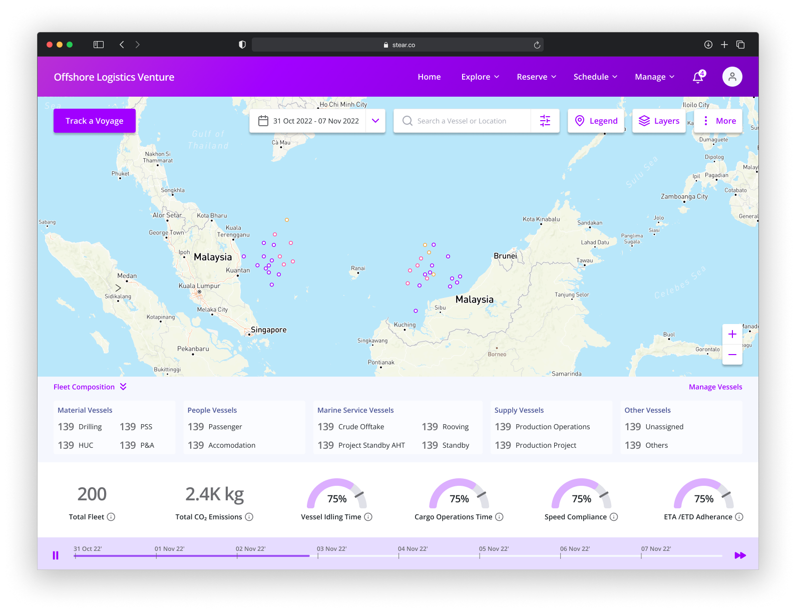
The product evolved (a services marketplace today, with handyman / household / health & beauty / education / and more categories), but the bones of the design system I established are still the bones of zonar.my and the apps:
You can verify the continuity by opening zonar.my alongside the screenshots above.
The 2020 version was Figma-first and human-maintained. The 2026 version would be: